The blog topic (like most of my interview question posts) comes from the Front-end Job Interview Questions. Today I’m moving away from JS to talk about CSS’s box model.
Explain your understanding of the box model.
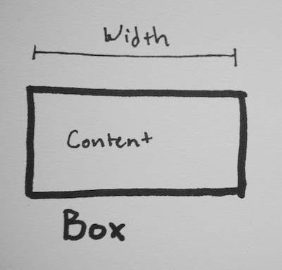
Well, first off what’s this “box” you're talking about?
In CSS, at least in reference to the box model, the “box” is the content area as defined by the width. So it looks something like this:
Hopefully that’s straight forward enough. However, browsers differ on what should and should not get included in the “content” area. Up for debate is the content itself (words), the padding, the borders, and the margin. As far as I know, everyone agrees that the words should count towards the width, and that the margin should not. But when it comes to the padding and border things are uncertain.
Some browsers (such as Firefox) think the width should only include the the content itself, not the padding, boarder, nor margin. Other browsers (such as IE) think the width should include the content, padding, and boarder, but not the margin. (So far I haven’t found anyone who thinks the padding should be in and the boarder out - they seem to always go as a pair.)
So for these two ways of looking at things, there are two ways to define the box. Let’s look at them one by one.
Content box
Go ahead and check out the CSS and HTML used to make the above. It’s all inline right there so you can see I’m not doing anything tricky.
Ok, to start with, we have a thick black line that’s exactly 150px wide. That’s your ruler. Next we have a div with an orange border (10px), blue padding (20px), and pink for the content itself. The div’s width is set to 150px using box-sizing: content-box, but, as you can see, the whole div is much larger than the 150px ruler just above it.
How much bigger?
Well, since the border (10px) and padding (20px) don’t count towards the total width, the entire div is 10px (border left) + 20px (padding left) + 20px (padding right) + 10px (border right) larger. Or 60px larger all up, giving it an “actual” width of 210px. Here it is again with a ruler set to 210px (just in case you don’t believe me):
Border box
The other way to measure it is to include the padding and the border, which is exactly what border box does. Here’s your example again:
Same as above there’s a thick black line set to 150px wide as a ruler. Then a div with the same measurements (an orange border (10px), blue padding (20px), and pink for the content itself). The div’s width is set to 150px using box-sizing: border-box, and the whole div is exactly the same width as the 150px ruler. This means the area for the content is smaller.
How much smaller?
Well, the same as above - 60px smaller. So the area for the content is only 90px wide.
How you would tell the browser in CSS to render your layout in different box models?
Well, exactly as above, using box-sizing: border-box or box-sizing: content-box depending on your need.
While it’s possible to set box-sizing per element (as I did in my examples) this is usually very confusing. If each element could be one way or another you wouldn’t know what widths to set on things until you checked which box model they used. Therefore it’s recommended to set box-sizing on all your elements with * { box-sizing: YOUR_DECISION_HERE; }.
Which one should I use?
This isn’t from the interview questions, but I think it’s interesting. Recently there’s been a big push to using border-box on everything. The idea is, when you set the width of a thing, you expect that to be the actual width, and not to have padding and borders hanging outside the area. This can be particularly confusing when trying to get things to line up next to each other (such as columns). So to keep up with common trends, border box is the way to go.
References
- As always, Mozilla is great for documentation
- Quirks Mode has some good visuals
- Paul Irish talks about why border box is the winner
- CSS Tricks goes into more details and covers far more edge cases than I got to here